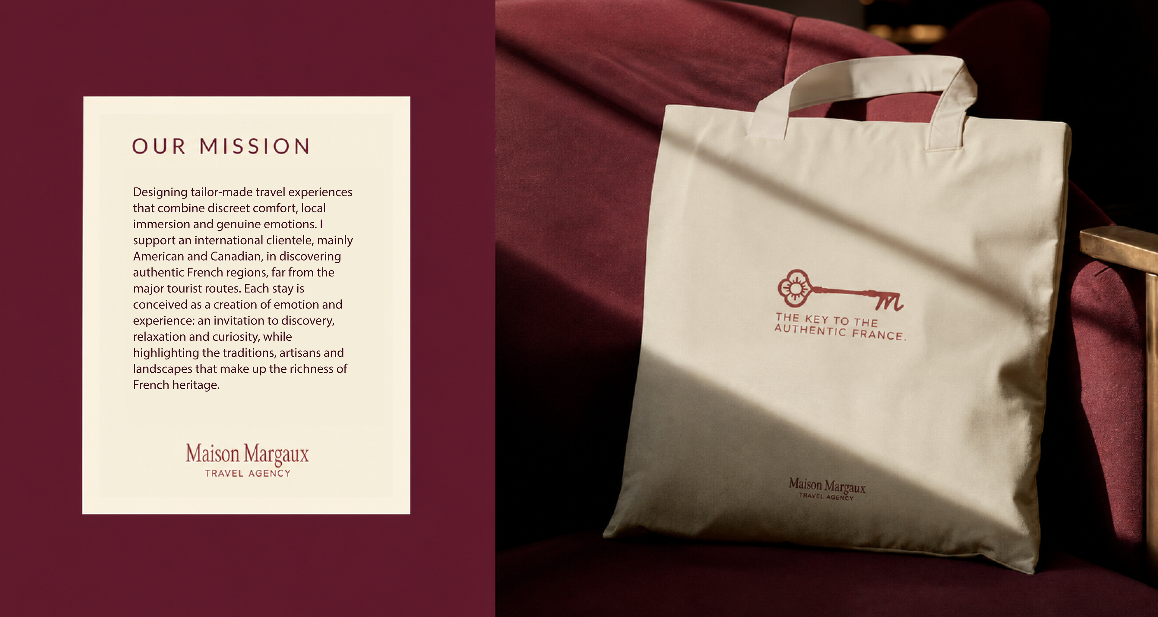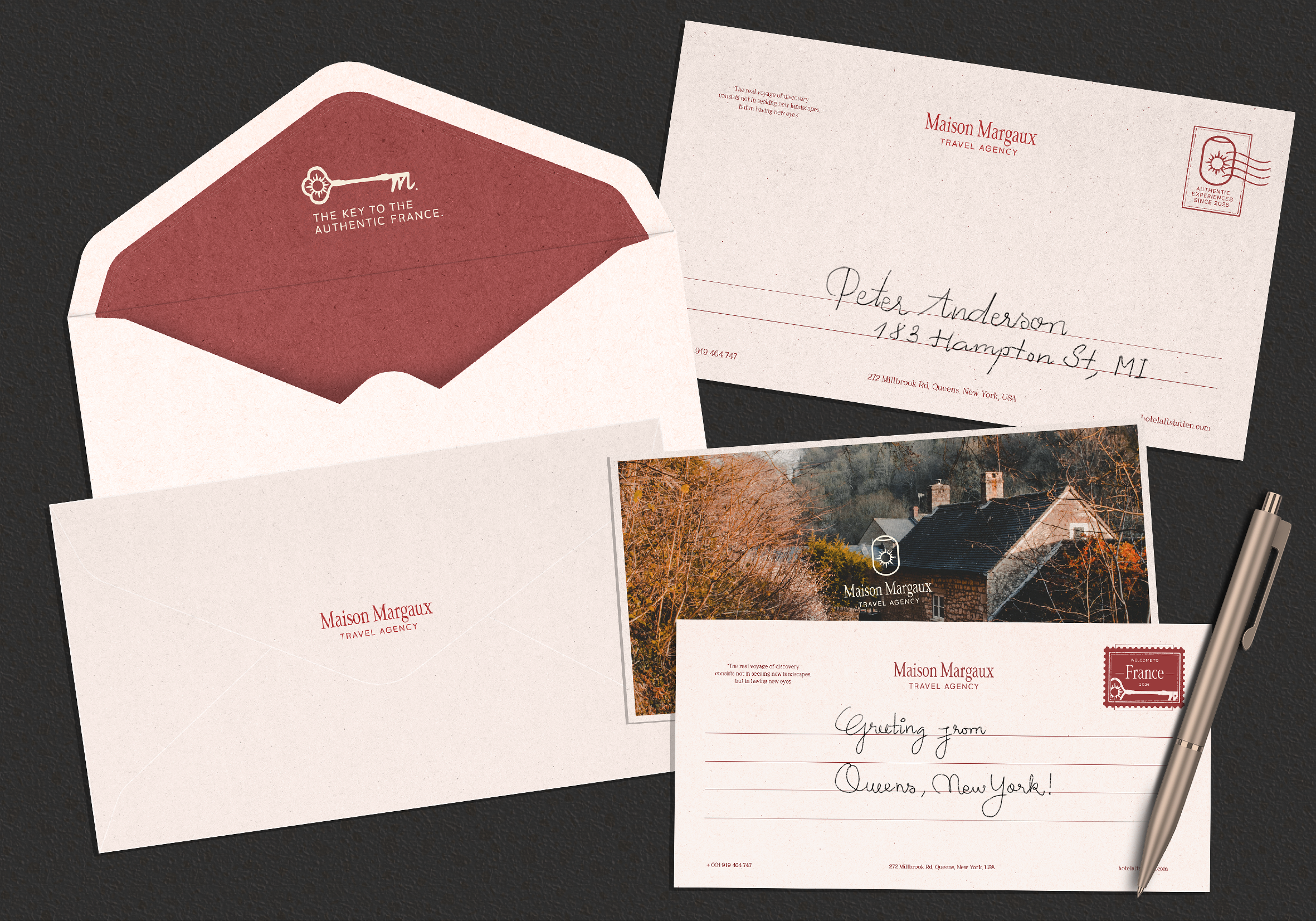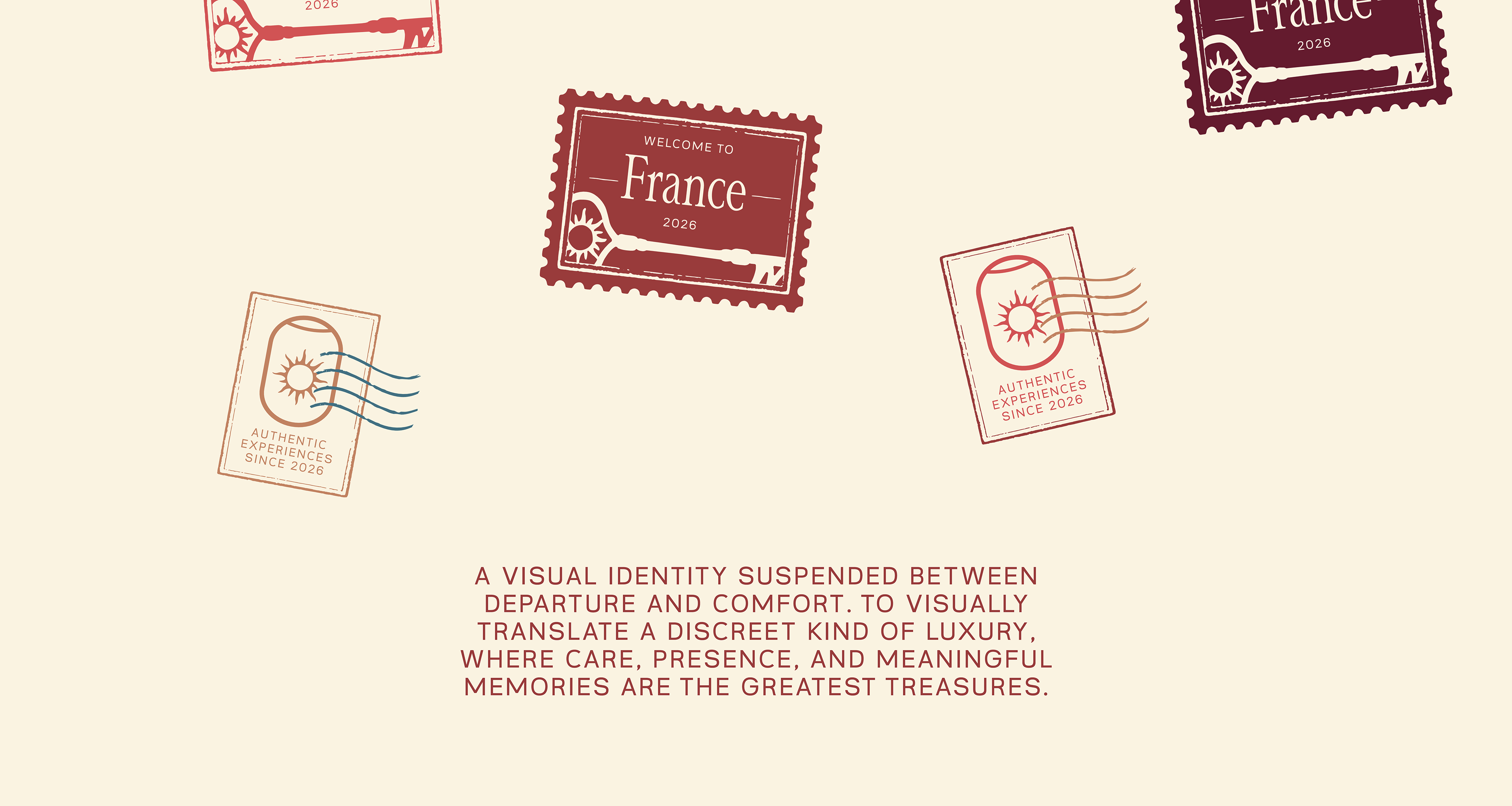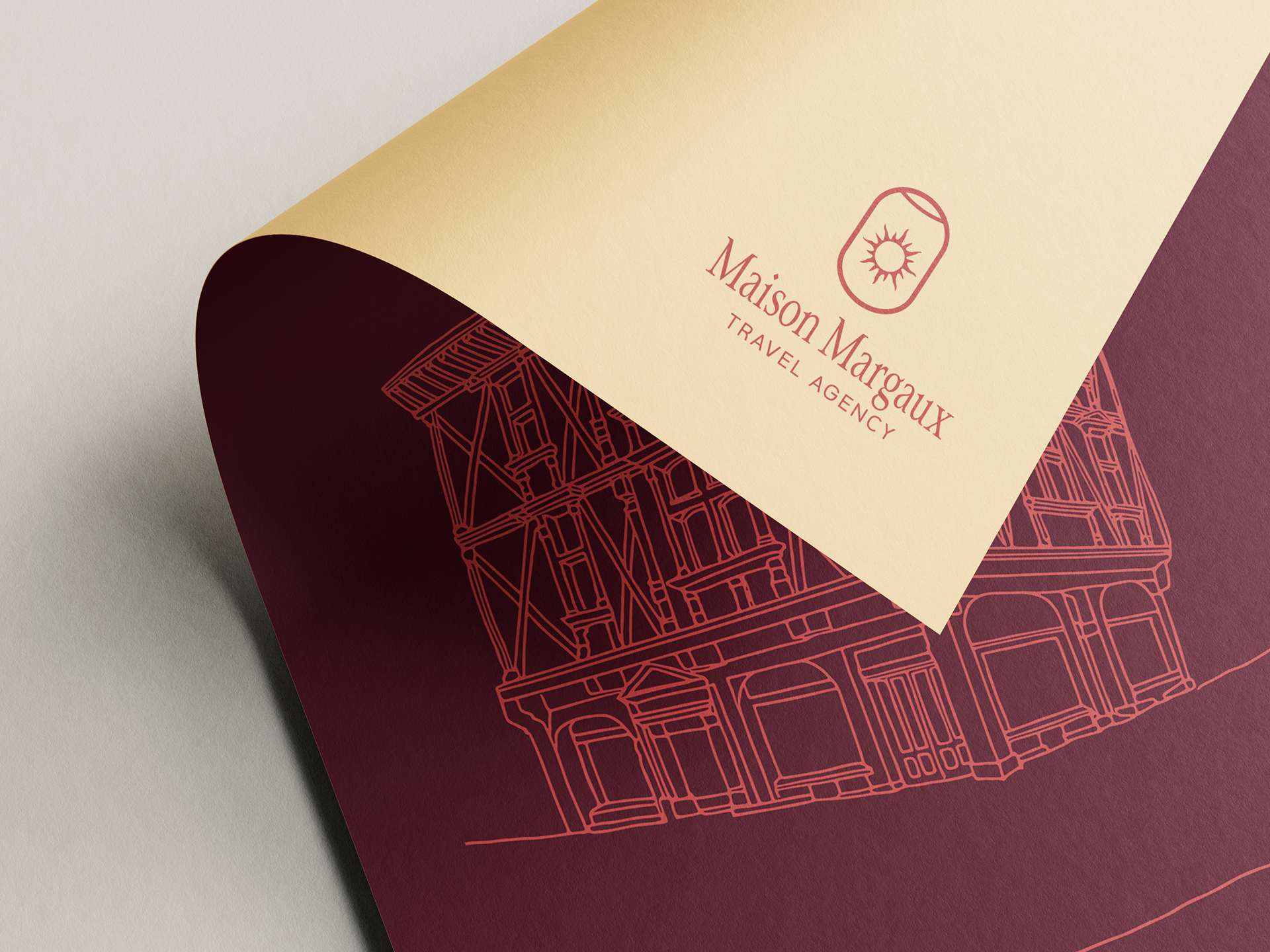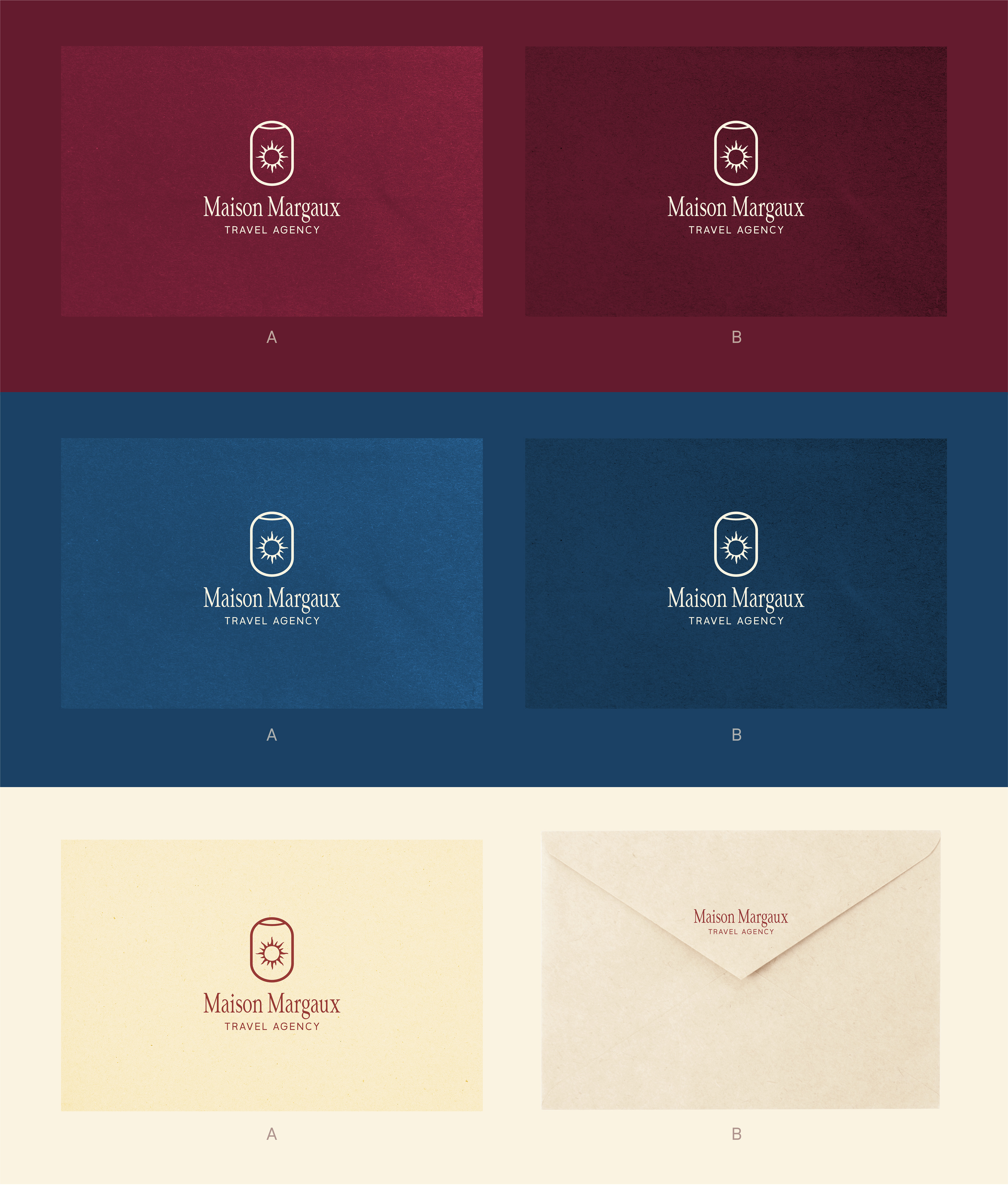
Maison Margaux Travel was born from the desire to transform every journey into a deeply human experience: warm, thoughtful, and carefully curated. Specializing in tailor-made trips through the South of France, the brand offers personalized itineraries that invite its clients to discover the region through authentic encounters, carefully selected addresses, and meaningful moments that create a true sense of belonging. The goal was to visually express this idea of understated and sensitive luxury, where refinement lies in attention to detail and the creation of lasting memories.
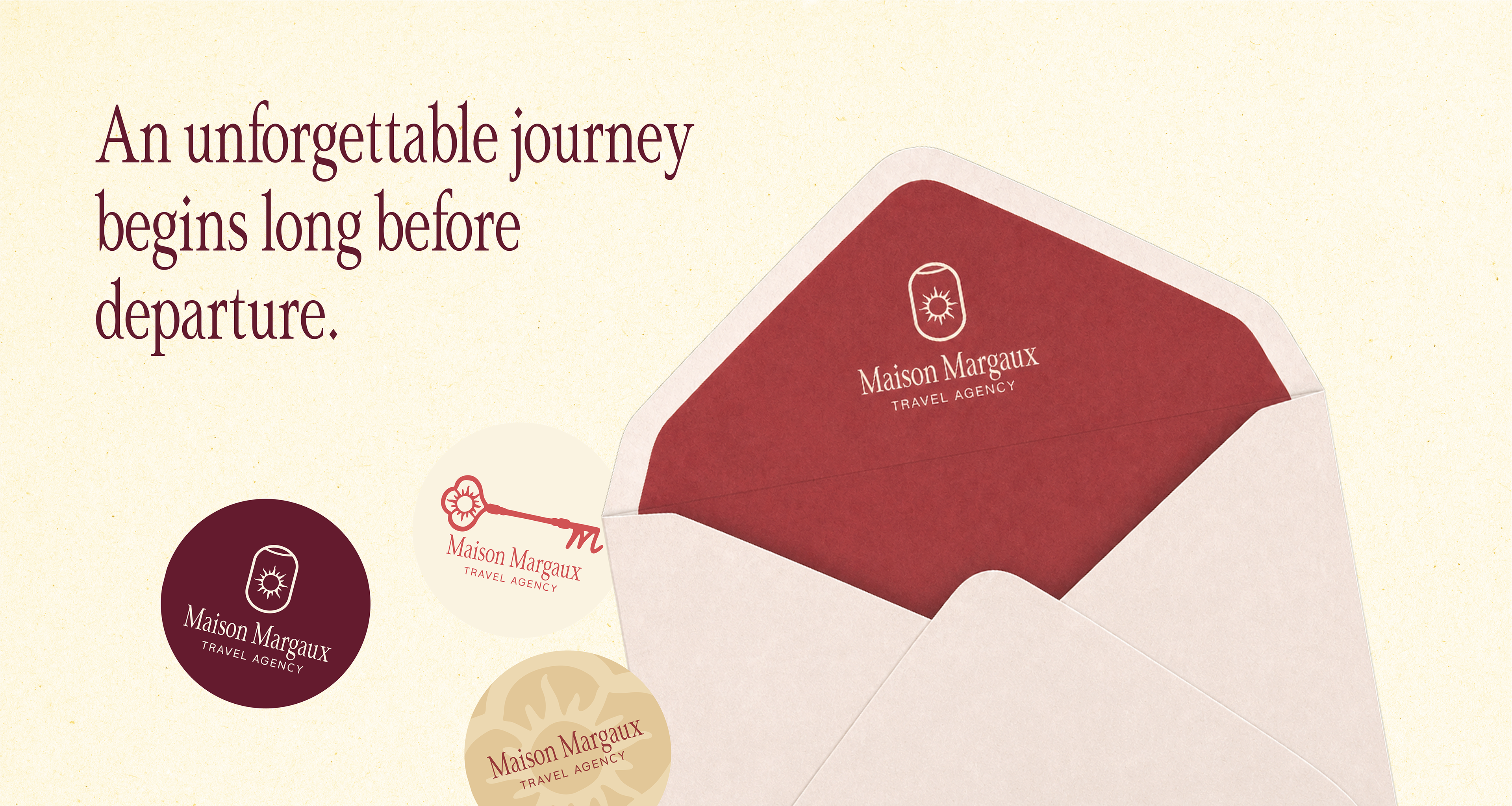
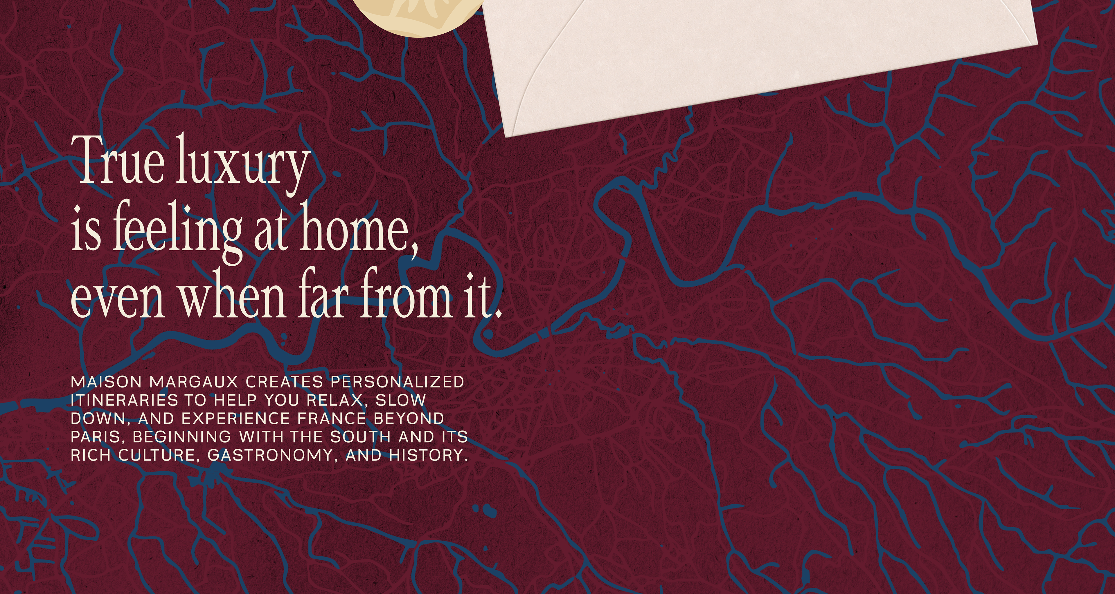
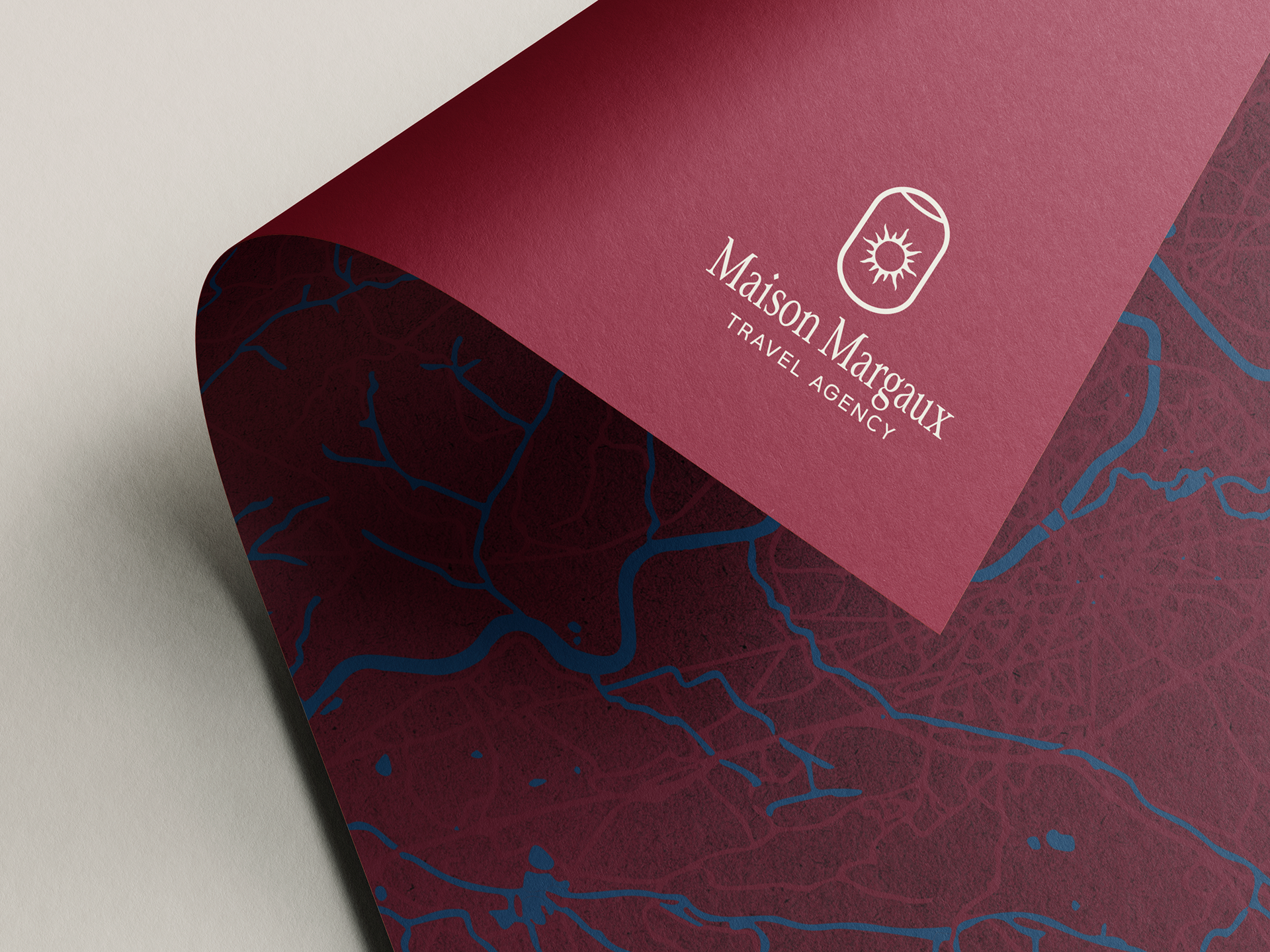
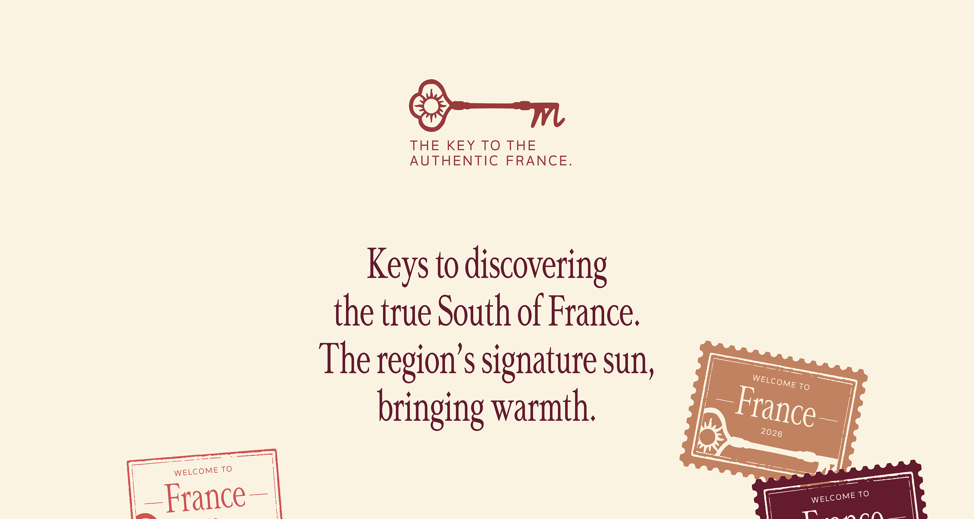
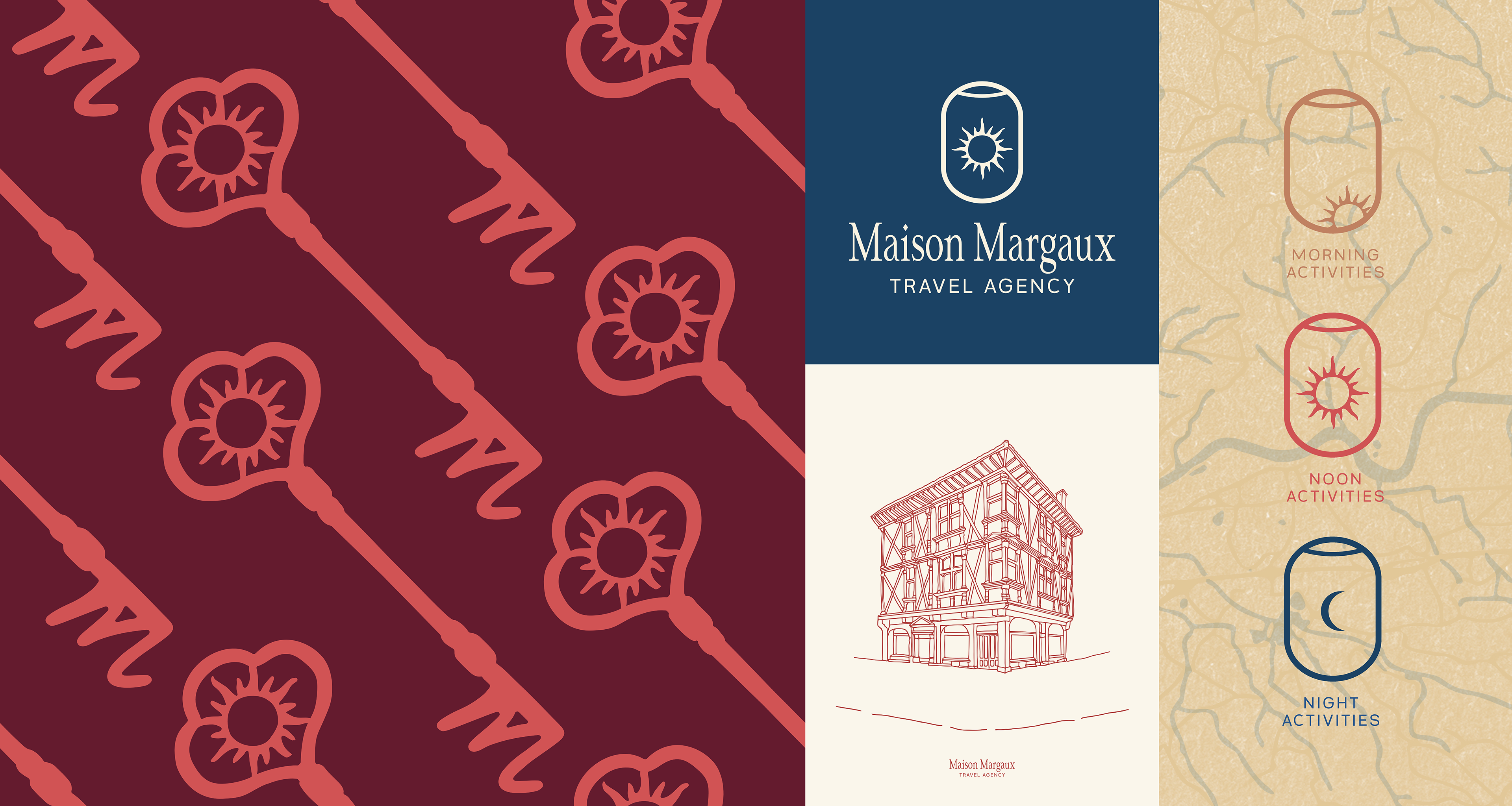
To shape the visual identity, the client chose two symbols that held special meaning: keys and the sun. The keys evoke the old houses of Southern France and the comforting feeling of being at home, even when far away, while the sun represents warmth, light, and the vibrant energy of the region. In my graphic interpretation, these elements were placed within the shape of an airplane window, creating a bridge between the worlds of travel and hospitality, and visually conveying a sense of discovery without losing the feeling of care and comfort